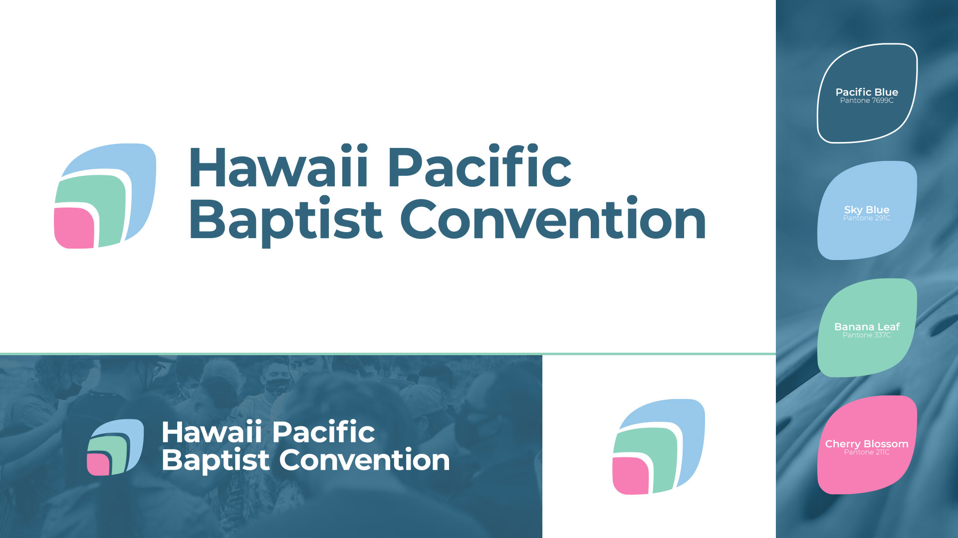
The Hawaii Pacific Baptist Convention (HPBC) is a fellowship of churches that spans the vast waters of the Pacific Ocean into the South Pacific Islands as well as Asia. They reached out to IFR because they felt their logo no longer represented the work that God was doing through the churches, so much so, that they stopped using their logo and replaced it with a typographic treatment placeholder.
HPBC desired a modern, abstract logo that captures the wholeness of their churches and shares their vision for the future. Through many drafts, we landed on this design: the shape representing a plumeria flower petal, often used in leis as a welcome icon to the islands. Normal capitalization was used in typography to represent the casual, welcoming nature of their culture. And the colors chosen came directly from the islands: cherry blossom (the start of their convention in Hawaii), banana leaf green (the topography of the islands and where there churches are), sky blue (the expanse of their ministry reaching into Asia), and the pacific blue (the region of the world where their ministry is focused).